Essential Typography & Layout Guide

Booklet

Mastering the Mark: A Definitive Student Guide to Typography, Hierarchy, and Grid Systems.
Comparison of Old Style and Modern serif typefaces with annotations. Old Style features diagonal axis, bracketed serif, angled head serif, and moderate contrast on the letters 'Old Style' with a sample of Garamond font styles listed. Modern shows vertical axis, straight and unbracketed serifs, and high contrast between thin and thick strokes on the word 'Modern' with a sample of Didot font styles listed. Text explains Old Style origins in Renaissance period with Venetian printers and Modern style pioneered by Didot and Bodoni with emphasis on elegance and precision.
The Brief

Typography & Layout Booklet

Synthesize core typography concepts learned throughout the quarter into a clear, visually compelling instructional booklet. The publication serves as a comprehensive reference guide for students and designers, translating abstract rules into actionable visual lessons on typeface classification, layout grids, hierarchy, and technical production standards.
Random lowercase letters a, b, c, d, e, f, and g in varying large sizes and shades of blue partly overlapping on a white background with a vertical dark teal stripe on the right.

Design Challenge

The primary design challenge lies in organizing dense typographic theory, history, and rules into a clean, scannable multi-page booklet. Fulfilling this requires maintaining a rigid three-column baseline grid across varied layouts, from anatomical diagrams to type specimens. Achieving a pristine visual flow demands meticulous micro-typographic precision in Adobe InDesign, balancing clean text rags and minimal hyphenation with custom kerning and strict punctuation standards.

A graphic design tribute to Max Miedinger with a black and white photograph of him seated on the left, accompanied by a biography and history of his font designs, including Neue Haas Grotesk which became Helvetica. The text details his career from apprentice typesetter to representative at the Haas Type Foundry with key dates from 1954 to 2019. On the right side is a section titled Citations, listing various sources related to typography and fonts, including websites and articles about typefaces and font styles. The background features a large abstract dark turquoise shape and white text.
Goals

Key Content & Curricula

  • Classifications & History: Breakdown of core type styles (Old Style, Modern, Slab Serif, Sans Serif, Script, Display) with historical context and specimens.
  • Anatomy & Concepts: Visual guide to letterform anatomy and font family vs. font file distinctions.
  • Layout Mechanics: Key rules for optical kerning, tracking, line length, font pairings, and visual hierarchy.
  • Micro-Typography Rules: Strict punctuation standards for em/en dashes, smart quotes, and minimal hyphenation.
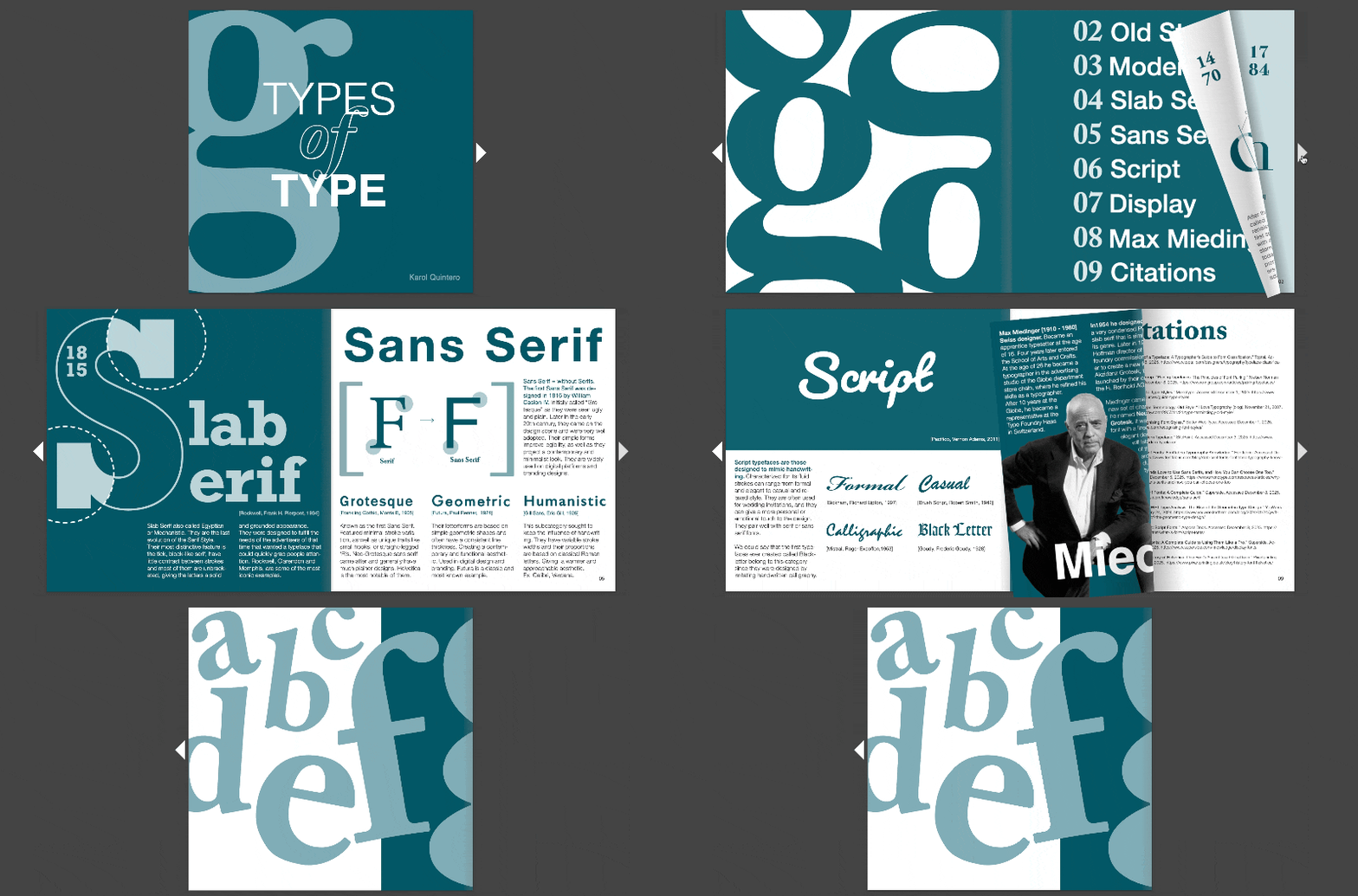
Animated GIF showing a square tile with the large letter 'g' in a light blue tone and the words 'TYPES of TYPE' in white and blue fonts on a dark teal background, rotating horizontally.
Editorial Layout

Booklet Design

The final interface proves that less is not a void. It is a room with the windows open.

Comparison of Old Style and Modern serif typefaces with annotations. Old Style features diagonal axis, bracketed serif, angled head serif, and moderate contrast on the letters 'Old Style' with a sample of Garamond font styles listed. Modern shows vertical axis, straight and unbracketed serifs, and high contrast between thin and thick strokes on the word 'Modern' with a sample of Didot font styles listed. Text explains Old Style origins in Renaissance period with Venetian printers and Modern style pioneered by Didot and Bodoni with emphasis on elegance and precision.
Typography infographic comparing Slab Serif and Sans Serif fonts. Left side shows a large stylized 'S' with block-like serifs and the text 'Slab Serif,' describing Slab Serif or Egyptian fonts as having thick, block-like serifs with little stroke contrast, unbracketed, providing a solid grounded look, designed for advertisers needing attention-grabbing typefaces like Rockwell and Clarendon. Right side titled 'Sans Serif' with an illustration of serif 'F' transforming to sans serif 'F.' Text explains Sans Serif fonts lack serifs, originated in 1816 by William Caslon IV, were once called Grotesque, gained adoption in the 20th century for legibility and minimalist style, and include subcategories Grotesque (Frankling Gothic), Geometric (Futura), and Humanistic (Gill Sans) with brief descriptions and examples like Helvetica, Calibri, and Verdana.
Typography guide showing Script and Display typefaces with examples and descriptions. Script typefaces mimic handwriting, ranging from formal to casual styles, often used for wedding invitations and emotional design. Examples include Formal, Casual, Calligraphic, and Black Letter, with respective creators and years noted. Display typefaces, also called decorative, are for visual impact in large-scale use such as headlines and logos, prioritizing style over readability. Sample Display fonts shown are Harry P, Budmo, Cooper, and Broadway, with creator credits and years. Typefaces Pacifico and Monoton by Vernon Adams 2011 are featured as titles.
A graphic design tribute to Max Miedinger with a black and white photograph of him seated on the left, accompanied by a biography and history of his font designs, including Neue Haas Grotesk which became Helvetica. The text details his career from apprentice typesetter to representative at the Haas Type Foundry with key dates from 1954 to 2019. On the right side is a section titled Citations, listing various sources related to typography and fonts, including websites and articles about typefaces and font styles. The background features a large abstract dark turquoise shape and white text.

See more work

The portfolio is deep. Keep moving. There is more to see and more to learn.